It’s not always that you get a nice and smooth yield curve.
Sometimes there are kinks.
Embedded in those kinks is a wealth of information.
For example, what does a kinky yield curve tell us about the interest rate expectations?
Well, let’s have a look 👇
So last Friday, I decided to spend my evening looking at a Portuguese sovereign yield curve.
(I know… but it’s still more exciting than watching Squid Games…)
And there was something odd about it.
The curve wasn’t smooth!
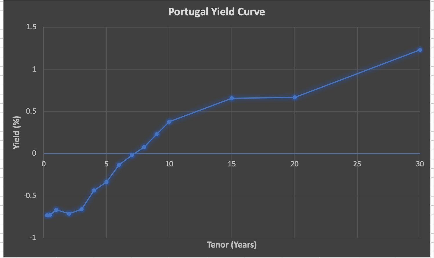
Ok, yes, market liquidity and all that jazz – maybe it shouldn’t be smooth to begin with?
Or there could be a multitude of other explanations, like credit risk, market conventions, high atmospheric pressure and bla bla bla…
(after all – the Fed! Because… well, why not?)
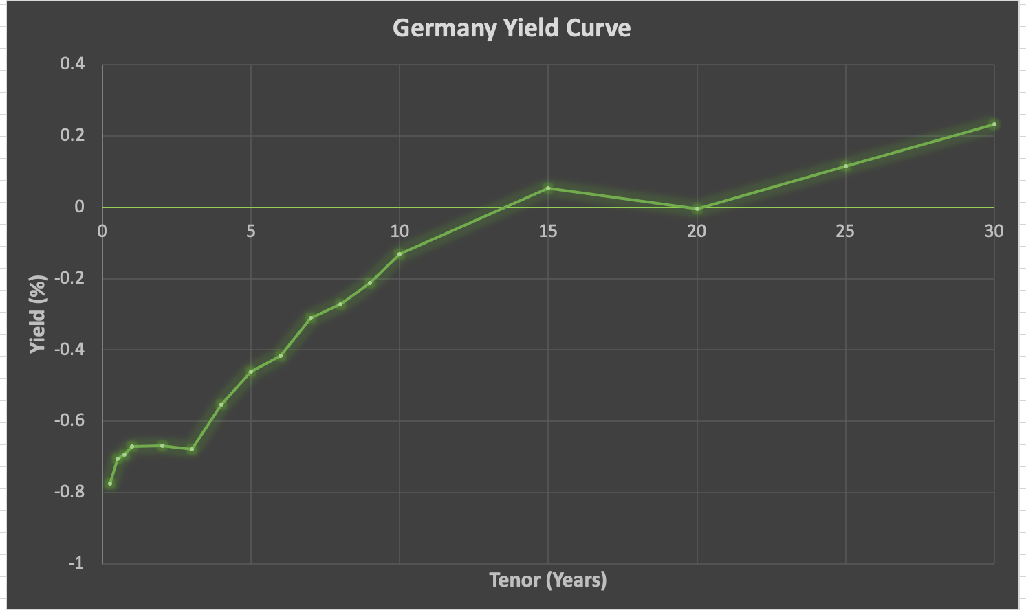
Fine, let’s instead have a look at the stronghold of European liquidity – Germany.
Wait, what?!
20Y, who hurt you? Why are you like that?
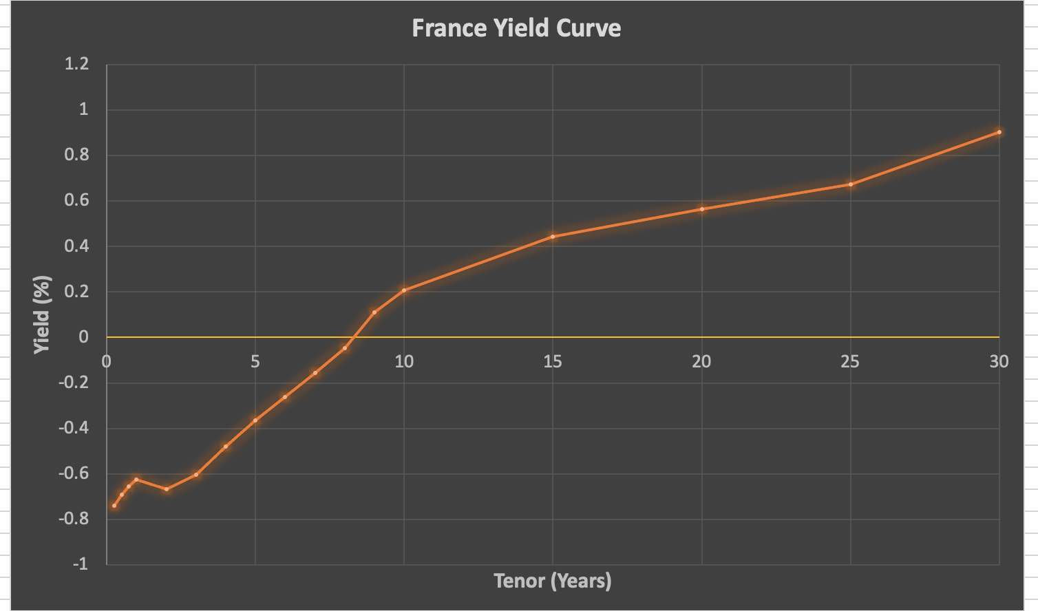
Ok, France looking better, but the perfectionist in me still sees that dip in yield at 25 years.
So what is it about these longer tenors that show a noticeable drop in yield?
Is that a structural phenomenon or just a noisy market data source?
Or maybe the market is pricing something?
Let’s find out!
First of all – what are we actually looking at?
The yield curve consists of the so-called “on-the-run” bonds.
These are the most recently issued government securities with maturities closest to fixed tenors.
For each bond, we can calculate its yield and plot it on a chart against its maturity.
And voilà! Je vous présente – a yield curve!
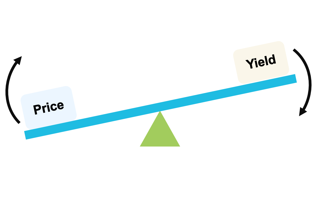
The yield curve effectively shows a return that can be achieved by an investor from lending over a given time frame.
For a government or a corporate, it also reflects their cost of borrowing.
During the good times, yield curves are typically upward sloping – the longer the maturity, the more return is demanded by the market.
Sometimes, they are also smooth.
But as we saw earlier – not always.
Let’s work with Germany as an example.
It looks as if there is a market anomaly!
If the yield curve is correct, it means that lending over a 15-year period yields a higher return than lending over 20 years!
This isn’t even consistent with the rest of the curve.
Ok, let’s have a look under the hood.
Below are the German on-the-run bonds used in the construction of the above yield curve.
Notice anything?
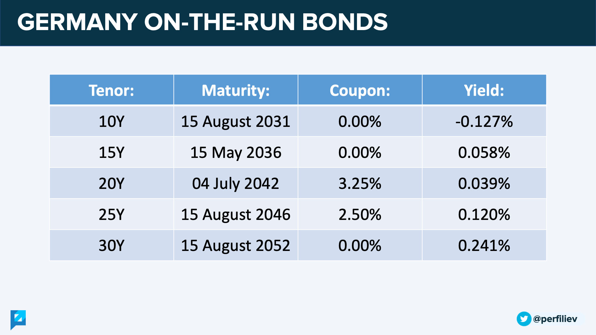
Exactly! The yield curve contains two antique and rare bonds that still pay coupons!
Perhaps they were issued when the EUR curve was much higher (…and the grass was greener and the light was brighter).
These days, bonds usually come in a zero-coupon flavour only.
The dip in the German yield curve occurs around the 20Y bond.
Not surprisingly, this is also the bond that pays the highest coupon of 3.25%.
However, despite the highest coupon, it offers a lower yield than what is implied by the neighbouring zero-coupon bonds.
And even a lower yield than a 15Y bond!
As they’re inversely related, a lower yield means a higher price, which reflects a higher demand and desirability for the 3.25% coupon 20Y bond.
Checking Portugal and France, we find the same story – the kinks on the curve occur when a high-coupon bond is used in the calculations.
For whatever reason, the market seems to like them more.
They are priced higher and consequently cause a dent in the yield curve.
You’re probably wondering – wait, but why?
Great question.
To help answer that, I started this discussion, comparing two similar bonds:
There are two bonds that are identical but have a different coupon amount.
Which one would you invest in and why?
(Also, does it make sense for them both to be priced at a 3% yield to maturity?) pic.twitter.com/JfWPORoHvC
— Sergei Perfiliev (@perfiliev) October 21, 2021
They are identical – apart from the coupon.
And what’s important is that they’re priced at the same yield-to-maturity (YTM).
Since the return is identical, does it matter which one we invest in?
First, let’s take a look at credit risk.
Bonds are BB+, which is just below the safety and comfort of investment-grade debt.
In case of default, the magic recovery number is 40%.
However, it’s calculated of the face value, which is $100 for both bonds.
If $40 is all we can recover, it’s better to pay $87.20 for it rather than $142.65.
So from the credit risk perspective, the cheaper 1.5%-coupon bond on the right carries less credit exposure and looks to be a better investment.
Moreover, this bond offers less reinvestment risk and potentially better tax treatment, depending on your jurisdiction.
And so, it should be priced at a lower yield than the 8%-coupon bond.
Unfortunately, that’s not what Mr Market is telling us.
From earlier, we saw that:
High coupon -> more desirable -> higher price -> lower yield
Low coupon -> less desirable -> lower price -> higher yield
Based on this logic, it is the expensive 8%-coupon bond that is more attractive.
Hence, it would trade at a lower yield compared to the 1.5%-coupon note.
And that’s despite its higher credit risk!
Why is that?
Why do investors pay an extra premium for higher coupon bonds?
Because right now, the market isn’t worried about credit risk as much as it is concerned about another, more serious kind of risk.
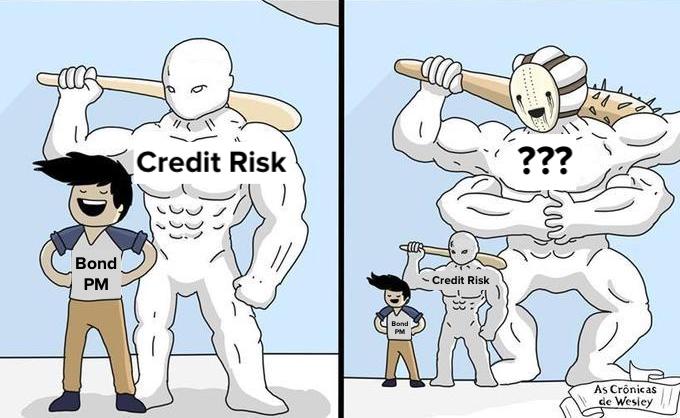
*Duration has entered the chat*
And that risk is the interest rate risk, as measured by duration.
Very simply, duration is a sensitivity of a bond’s price to changes in interest rates.
The higher the duration, the more the bond will lose (gain) if rates rise (fall).
Duration depends on many factors, including:
• Maturity: the longer the maturity, the higher the duration.
• Coupon Amount: the higher the coupon, the lower the duration.
Zero-coupon bonds on the long end of the yield curve carry the highest interest rate risk.

For the two bonds that we discussed above, the discriminating factor was the coupon.
The 8% coupon bond has a lower duration and is less sensitive to interest rate changes than the 1.5% coupon note.
This comes very handy if one expects rates to rise.
And apparently, the market does.
As we saw earlier, lower-duration coupon-bearing bonds are priced higher and yield lower, causing kinks on the yield curve.
The increased demand for low duration products seems to confirm the market’s expectation of higher rates.
This is further fuelled by higher inflation expectations.
Some metrics, such as the US 5yr breakeven rates, have reached decade highs…

…while the “Elon Musk Inflation Tweet Indicator” is at an all-time-high altogether:
I don’t know about long-term, but short-term we are seeing strong inflationary pressure
— Elon Musk (@elonmusk) October 26, 2021
Hence, investors are willing to pay an extra premium to get their hands on a bond that will not fold like the house of cards after the first rate hike.
Well… at least not as much.
Something that’s not easy to find among many bonds today.
Over the last decade, governments and corporates have made full use of zero-interest-rate policies (ZIRP) and issued a bajillion of long-term bonds with zero/low coupons.
You know… the ones with maximum interest rate risk.
Yeah, those ones.
So much that Bloomberg is now reporting that:
“…investors’ exposure to duration […] is near record highs. Even a half-percentage point jump in yield from here […] would be enough to ravage funds of all stripes.”
Of course, not all is bad, as zero-coupon bonds also offer higher convexity to make up for the duration sensitivity.
But that’s a story for another thread 🙂
Thank you so much for taking the time to read this! I sincerely hope you found it interesting and valuable.
Follow me on Twitter (https://twitter.com/perfiliev) for more educational threads around stocks, options and other topics within the incredible world of financial markets.

We're got a lot more exciting stuff coming up and we'd love to tell you about it.
